Bootstrap 4 dialogs





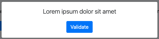
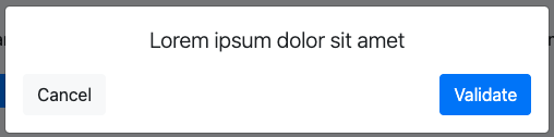
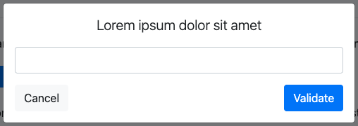
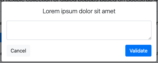
BSD is a tiny and flexible collection of dialog popups based on Bootstrap 4 modals.
Custom dialogs can be easily defined, in addition to built-in ones (alert, confirm and prompt).
Any contribution or feedback is highly welcomed, please feel free to create a pull request or submit a new issue.
Screenshots
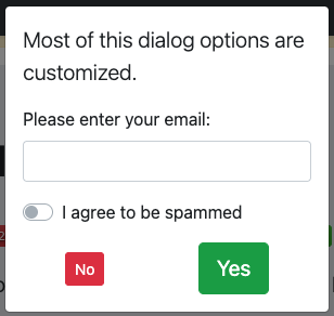
Quick start
BSD requires jQuery v1.9.1+, Bootstrap 4 modal component, and Bootstrap's CSS.
Several quick start options are available:
-
Install with npm:
npm i bgaze-bootstrap4-dialogs -
Install with yarn:
yarn add bgaze-bootstrap4-dialogs -
Install via CDN:
https://cdn.jsdelivr.net/gh/bgaze/bootstrap4-dialogs@2/dist/bootstrap4-dialogs.min.js -
Install with Composer:
composer require bgaze/bootstrap4-dialogs - Download the latest release: https://github.com/bgaze/bootstrap4-dialogs/releases
-
Clone the repo:
git clone https://github.com/bgaze/bootstrap4-dialogs.git
Just make sure to include required dependencies into your app, then include the library:
-
If installed as a module, import it:
const bsd = require("bgaze-bootstrap4-dialogs"); -
Otherwise include the script into your page:
<script src="path/to/bootstrap4-dialogs.js"></script>
That's it!
Now you can use the globally declared bsd object.
// Alert
bsd.alert('Lorem ipsum dolor sit amet');

// Confirm
bsd.confirm('Lorem ipsum dolor sit amet', function (confirmed) {
    if (confirmed) {
        // ...
    }
});

// Prompt
bsd.prompt('Lorem ipsum dolor sit amet', function (value) {
    if (value !== null) {
        if (value.trim() === '') {
            return false; // Prevent dialog closing, as provided value is empty.
        }

        console.log(value);
    }
});
Usage
When a bsd method is called, a customized Bootstrap 4 modal will be dynamically built and inserted into the DOM.
Unless explicitly specified through options, it is automatically shown when created, and destroyed when closed.
Arguments
Dialog functions accept two arguments:
title: the html to insert into the dialog popup title.
options: an optional set of options. If a function is provided, it will be used as dialog callback.
All available options can be customized globally as explained in the global configuration section.
// Simple dialog
bsd.alert('A message to display');

// Simple dialog with direct callback assignment
bsd.confirm('A message to display', function (confirmed) {
    if (confirmed) {
        console.log('Confirmed !');
    }
});

// Customized dialog
bsd.confirm('A message to display', {
    callback: function (confirmed) {
        if (confirmed) {
            console.log('Confirmed !');
        }
    },
    size: 'sm',
    cancelText: "No",
    confirmText: "Yes"
});
Handling dialogs
Each dialog function returns its modal element as a jQuery object, so Bootstrap modal methods
and events can be directly used, except show.bs.modal.
bsd.alert('A message to display')
    .on('shown.bs.modal', function (event) {
        // ...
    })
    .modal('handleUpdate');
The show.bs.modal event is fired before returning the modal, so to use it, you'll need to manage modal opening manually:
bsd.alert('A message to display', {show: false})
    .on('show.bs.modal', function (event) {
        // ...
    })
    .modal('show');
As a shorthand, you can directly pass a function into the show option :
bsd.alert('A message to display', {
    show: function (event) {
        // ...
    }
});
Global configuration
BSD default options are stored in the bsd.defaults object and organized this way:
bsd.defaults.dialog: common options for all dialogs.bsd.defaults.[dialogName]: dialog specific options.
You can easily make application wide customizations:
// Make all dialogs centered vertically and horizontally.
bsd.defaults.dialog.vcenter = true;
bsd.defaults.dialog.hcenter = true;

// Define default buttons texts for confirm dialogs.
bsd.defaults.confirm.cancelText = 'No';
bsd.defaults.confirm.confirmText = 'Yes';
Please note that each dialog specific configuration inherits with precedence from common options.
So global configuration can be overridden at each dialog level:
// Use small size for all dialogs except prompt.
bsd.defaults.dialog.size = 'modal-sm';
bsd.defaults.prompt.size = null;
Theming
There is no stylesheet provided with BSD, as it only relies on Bootstrap styles.
To ease dialogs theming, two CSS classes are automatically added to each dialog :
bsd-dialogbsd-[dialogName](for instancebsd-alertfor alert dialogs).
Common options
This is the list of options available for all dialogs.
| Option | Accepted values (bold = default) | Description |
|---|---|---|
| callback | null, function |
A callback to call on dialog dismiss or button click. Please see each dialog doc for more details. |
| id | null, string |
A value to use as an id attribute for the modal |
| show | true, false, function |
Show the modal element when created. If a function is provided, the modal will be shown and the function will be used on show.bs.modal event.
|
| destroy | true, false |
Delete the modal element when closed |
| size | null, 'modal-sm', 'modal-lg', 'modal-xl' |
Dialog size |
| backdrop | true, false, 'static' |
Include a backdrop element. With static option, backdrop doesn't close the modal on click. |
| keyboard | true, false |
Closes the dialog when escape key is pressed |
| vcenter | true, false |
Center vertically the dialog in the window |
| hcenter | true, false |
Center horizontally the dialog text |
| controlsAlignment | 'between', 'center', 'start', 'end', 'around' |
Dialog controls horizontal alignment |
Built-in dialogs
Alert
Usage
Simple call:
bsd.alert('Lorem ipsum dolor sit amet');Simple dialog with direct callback assignment:
bsd.alert('Lorem ipsum dolor sit amet', function () {
    // ...
});
Customized dialog
bsd.alert('Lorem ipsum dolor sit amet', {
    closeText: "OK",
    closeClass: "btn-success",
    callback: function () {
        // ...
    }
});
Options
Alert dialogs accept the following options in addition to common options.
| Option | Default | Description |
|---|---|---|
| template |
|
The template used to generate dialog. If you need to change this option, make sure to keep all bsd-* classes, which are necessary to make the dialog work.
|
| closeText | Validate |
The close button text |
| closeClass | btn-primary |
The class to add to close button |
| controlsAlignment | 'around', 'center', 'start', 'end', 'between' |
Dialog controls horizontal alignment |
Confirm
Usage
The callback function will receive a boolean as argument.
Make it return false to keep the dialog opened, otherwise it will be closed.
Simple call:
bsd.confirm('Lorem ipsum dolor sit amet', function (confirmed) {
    if (confirmed) {
        // ...
    }
});
Call with options:
bsd.confirm('Lorem ipsum dolor sit amet', {
    confirmText: "Delete",
    confirmClass: "btn-danger",
    callback: function (confirmed) {
        if (confirmed) {
            // ...
        }
    }
});
Options
Confirm dialogs accept the following options in addition to common options.
| Option | Default | Description |
|---|---|---|
| template |
|
The template used to generate dialog. If you need to change this option, make sure to keep all bsd-* classes, which are necessary to make the dialog work.
|
| cancelText | Cancel |
The cancel button text |
| cancelClass | btn-light |
The class to add to the cancel button |
| confirmText | Validate |
The confirm button text |
| confirmClass | btn-primary |
The class to add to confirm button |
Prompt
Usage
The callback function will receive null on cancel/dismiss, and the user input on submit.
Make it return false to keep the dialog opened, otherwise it will be closed.
Simple call:
bsd.prompt('Lorem ipsum dolor sit amet', function (value) {
    if (value !== null) {
        if (value.trim() === '') {
            return false;  // Prevent dialog closing, as provided value is empty.
        }

        console.log(value);
    }
});
Call with options:
bsd.prompt('Lorem ipsum dolor sit amet', {
    confirmText: "Save",
    confirmClass: "btn-success",
    callback: function (value, event) {
        if (value !== null) {
            if (value.trim() === '') {
                return false;  // Prevent dialog closing, as provided value is empty.
            }

            console.log(value);
        }
    }
});
Options
Prompt dialogs accept the following options in addition to common options.
| Option | Default | Description |
|---|---|---|
| multiline | false |
Pass true to create a multiline prompt |
| field |
|
Controls the dialog input, accepts string, jQuery object, function.
If a function is provided, it receives the dialog multiline parameter and must return a value compatible with jQuery appendTo function.
|
| value |
|
A function controlling the value to be passed to the dialog callback. It receives the dialog modal element, and returns the user input. |
| template |
|
The template used to generate dialog. If you need to change this option, make sure to keep all bsd-* classes, which are necessary to make the dialog work.
|
| cancelText | Cancel |
The cancel button text |
| cancelClass | btn-light |
The class to add to the cancel button |
| confirmText | Validate |
The confirm button text |
| confirmClass | btn-primary |
The class to add to confirm button |
Custom dialogs
If you need to create custom dialogs, you can easily extend BSD:
1/ Define your dialog options and defaults
Simply append them to bsd.defaults, using your dialog name as key.
Remember that your dialog options inherit from bsd.defaults.dialog, so you can override them.
The only required option is the dialog template (template key).
bsd.defaults.mydialog = {
// The template used to generate dialog.
template: `<div class="modal fade" tabindex="-1" role="dialog" aria-hidden="true">
<div class="modal-dialog" role="document">
<div class="modal-content">
<div class="modal-header">
<h5 class="modal-title bsd-title"></h5>
<button type="button" class="close" data-dismiss="modal" aria-label="Close">
<span aria-hidden="true">×</span>
</button>
</div>
<div class="modal-body">
<p class="bsd-subtitle"></p>
</div>
<div class="modal-footer">
<div class="bsd-controls d-flex flex-grow-1 align-items-center">
<button type="button" class="btn bsd-no mr-1" data-dismiss="modal"></button>
<button type="button" class="btn bsd-maybe mx-1"></button>
<button type="button" class="btn bsd-yes ml-1"></button>
</div>
</div>
</div>
</div>
</div>`,
// No button.
noText: 'No',
noClass: 'btn-danger',
// Maybe button.
maybeText: 'Maybe',
maybeClass: 'btn-primary',
// Yes button.
yesText: 'Yes',
yesClass: 'btn-success',
// DEFAULTS OVERRIDE EXAMPLE
// Center horizontally the dialog text: true | [false]
hcenter: false,
};2/ Create the dialog function
You can easily generate the dialog thanks to bsd.dialog function which requires three arguments :
- The dialog name (must match key into
bsd.defaults). - The options set provided by the user.
- A customize function, that will receive as arguments:
- the modal jQuery object
- the final settings (user's options set merged with dialog defaults and common defaults).
From the customize function:
- Initialize the modal content based on settings.
- Configure each dialog button to fire an event. As the dismiss.bsd event is fired when dialog is closed with Escape key or outside click, it should also be fired by any cancel button into the custom dialog.
- Use these events to invoke callback function.
bsd.mydialog = function (title, subtitle, options) {
    return this.dialog('mydialog', options, function ($dialog, settings) {
        // Manage dialog texts.
        $('.bsd-title', $dialog).html(title || '');
        $('.bsd-subtitle', $dialog).html(subtitle || '');

        // Customize buttons.
        $('.bsd-no', $dialog).addClass(settings.noClass).text(settings.noText).click(function () {
            $dialog.trigger('dismiss.bsd');
        });
        $('.bsd-maybe', $dialog).addClass(settings.maybeClass).text(settings.maybeText).click(function () {
            $dialog.trigger('maybe.bsd');
        });
        $('.bsd-yes', $dialog).addClass(settings.yesClass).text(settings.yesText).click(function () {
            $dialog.trigger('yes.bsd');
        });

        // Manage dialog callback.
        if (typeof settings.callback === 'function') {
            $dialog
                .on('dismiss.bsd', function () {
                    settings.callback('no');
                })
                .on('maybe.bsd', function () {
                    if (settings.callback('maybe') !== false) {
                        $dialog.modal('hide');
                    }
                })
                .on('yes.bsd', function () {
                    if (settings.callback('yes') !== false) {
                        $dialog.modal('hide');
                    }
                })
            ;
        }
    });
};
3/ Usage
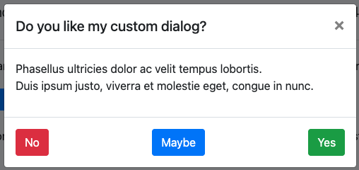
Simply use your dialog like other ones, which renders:
$('#mydialog-demo').click(function () {
    var subtitle = 'Phasellus ultricies dolor ac velit tempus lobortis.<br>Duis ipsum justo, viverra et molestie eget, congue in nunc.';

    bsd.mydialog('Do you like my custom dialog?', subtitle, function (value) {
        console.log(value);
    });
});
Other packages
Feel free to visit my other packages:
bgaze/bootstrap-form
Bootstrap 4 & 5 forms builder for Laravel 12+
This package simplifies Bootstrap 4 & 5 forms creation in Laravel applications 12+
It renders Bootstrap 5 markup by default and fully supports Bootstrap 4 for backward compatibility.
Model form binding and automatic error display are supported, as well as most Bootstrap form features: form layouts, custom fields, input groups, and more.
bgaze/laravel-kvstore
Key-value store for Laravel 12 & 13
A database-backed key-value store for Laravel 12 & 13, sized for settings: read on most requests, written rarely.
The whole store is cached as one single entry, so a cold read costs one query for every key at once.
Each entry carries its own cast, so a value always reads back as what it was written as.
SnapStack
100% local browser captures for your AI assistant
SnapStack is a browser extension that captures any tab in one click and stacks it locally, so your AI assistant can read the screenshots on demand over MCP.
Nothing is ever uploaded: captures go only to a small server on your own machine. No account, no telemetry.
Works with any MCP-capable client (Claude Code and others), on Chrome, Edge and Firefox.
@bgaze/color-palette
A grid colour picker in the spirit of Google Docs
Vanilla TypeScript, with a single runtime dependency for the positioning.
It works standalone, ships optional Bootstrap 4 and Bootstrap 5 themes, and is accessible on purpose.