Color Palette





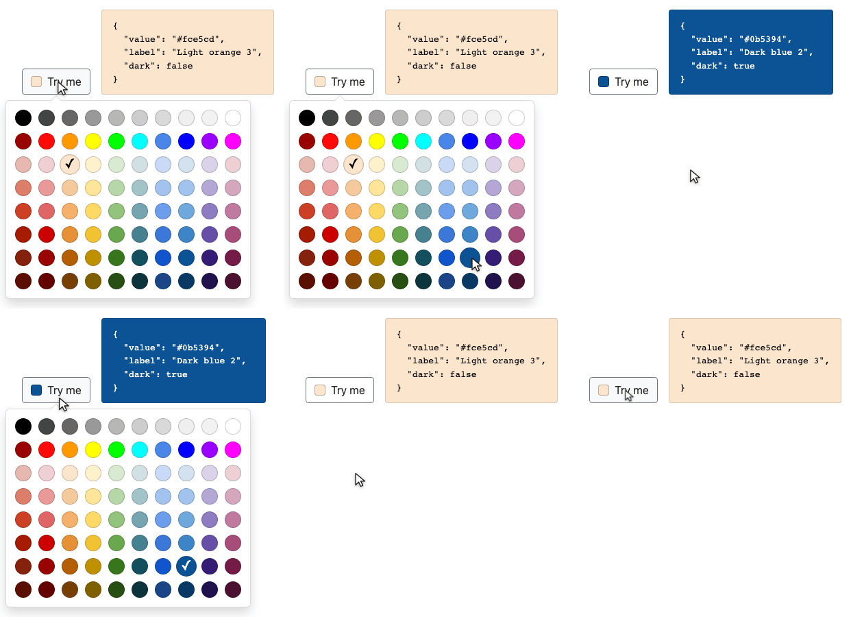
Click a trigger, pick a swatch from a floating panel, get the value back
Vanilla TypeScript, one runtime dependency for the positioning. It works standalone, with no CSS framework at all, and ships Bootstrap 4 and Bootstrap 5 themes for applications that have one.
An LLM-optimized documentation is included for your AI assistants.
Any contribution or feedback is highly welcomed, please feel free to create a pull request or submit a new issue.
Live demo
One page per theme, each built by the package itself, so what you see is the stylesheet you would install:
- Standalone — no CSS framework on the page at all
- Bootstrap 5 — the panel reading Bootstrap 5's popover variables
- Bootstrap 4 — the same, against Bootstrap 4
All three carry the same four examples, each printed next to the markup and script that produce it.
Highlights
- Standalone, or native-looking. A theme is a set of Sass values, not a set of rules. Recompile a Bootstrap theme against your variables and the picker follows.
- Accessible on purpose. A real grid of buttons, ARIA roles, a roving tabindex, full arrow /
Home/Endnavigation, focus handed back to the trigger on close. - Declarative or programmatic.
data-color-paletteplusdata-cp-*attributes, or instances built in code. Same component either way. - Escaping is structural. The panel is built as DOM nodes and text is set with
textContent. There is no escaping option to forget. - Typed end to end. Strict TypeScript, typed options, typed event payloads.
Installation
Evergreen browsers, ES2020, no polyfills, screens from 360px up. Building from source needs Node 20.19+.
npm install @bgaze/color-palette
Or from a CDN, with no build step at all:
<link rel="stylesheet" href="https://unpkg.com/@bgaze/color-palette/dist/css/color-palette.css" />
<script src="https://unpkg.com/@bgaze/color-palette"></script>
The bundle may sit in the <head>: it waits for DOMContentLoaded.
Entry points
| Subpath | What it is |
|---|---|
@bgaze/color-palette |
the class, the types, and automatic initialization (ESM and CJS). Also exports CLASSES, the frozen class-name set, and TRIGGER_SELECTOR |
@bgaze/color-palette/i18n/en, /i18n/fr |
a bundled palette, as a side-effect-free data module |
@bgaze/color-palette/css/standalone |
the compiled standalone stylesheet |
@bgaze/color-palette/css/bootstrap4, /css/bootstrap5 |
the compiled Bootstrap themes |
@bgaze/color-palette/scss/* |
the Sass sources, to recompile a theme yourself — see Themes |
Each compiled stylesheet also ships minified next to it (….min.css).
The entry you pick changes one thing: how a palette reaches the component. The ES module bundles none, so you import one and pass it in; the UMD bundle carries both on ColorPalette.palettes. Options, API, events and markup are identical.
Quick start
Three ways in, from the most to the least JavaScript. All produce the same component.
With a bundler
import { ColorPalette } from '@bgaze/color-palette'
import { en } from '@bgaze/color-palette/i18n/en'
import '@bgaze/color-palette/css/standalone'

// Before the module's own automatic initialization, which is deferred by one microtask.
ColorPalette.setDefaults({ colors: en })

const palette = new ColorPalette(document.querySelector('#trigger')!)
palette.value = '#4a86e8'
A default palette is the whole configuration most applications need: every trigger on the page starts from it.
From a script tag, with no bundler
<link rel="stylesheet" href="https://unpkg.com/@bgaze/color-palette/dist/css/color-palette.css" />
<script src="https://unpkg.com/@bgaze/color-palette"></script>
<script>
  ColorPalette.setDefaults({ colors: ColorPalette.palettes.en })
</script>

<button type="button" data-color-palette data-color="#4a86e8">Colour</button>
Nothing to import: the UMD bundle carries en and fr on ColorPalette.palettes.
Without a line of JavaScript
Once a default palette is set, a trigger is markup and nothing else:
<button
  type="button"
  data-color-palette
  data-color="#4a86e8"
  data-cp-title="Colours"
  data-cp-placement="right"
  data-cp-close-on-select="false"
>
  Colour
</button>
The selection lives in data-color on the trigger, so a form can submit it and a stylesheet can react to it with no script of your own.
Automatic initialization
Every element matching [data-color-palette] gets an instance, one microtask after the module is evaluated — which is what lets ColorPalette.setDefaults({ colors }) sit right after the import and still be seen.
- No palette configured → one warning, nothing initialized. A declarative trigger must not take the page down. Explicit construction with an empty palette throws.
- Turn it off with
<html data-cp-autoinit="off">, then instantiate by hand. - Run it yourself over injected markup with
ColorPalette.autoInit(root). It skips elements that already have an instance.
Options in markup
| Attribute | Option | Notes |
|---|---|---|
data-color |
(the value) | the selection itself; wins over the value option |
data-cp-placement |
placement |
auto | top | bottom | left | right |
data-cp-offset |
offset |
a number |
data-cp-title |
title |
any text, empty included |
data-cp-label |
label |
the grid's accessible name |
data-cp-close-on-select |
closeOnSelect |
false, 0, no, off mean no; anything else, including an empty value, means yes |
An unreadable value (data-cp-offset="a bit") is ignored with a warning, never guessed.
colors, container and value have no attribute: a palette does not fit in one, a container is resolved by the caller, and the value already has data-color.
Precedence
Least specific first: shipped defaults → data-cp-* attributes → constructor options. Automatic initialization passes no options, so markup rules there. One exception runs the other way: data-color beats the value option, because it carries state rather than configuration.
setDefaults(partial) merges key by key and copies the palette in and out, so mutating the array you handed it does not reach the store. resetDefaults() restores the shipped baseline.
What the markup becomes
The panel is built as DOM nodes and appended to document.body — which is why the open state lives on the trigger, the only element that stays put.
<!-- what you write -->
<button
  type="button"
  data-color-palette
  data-color="#000000"
  data-cp-title="Colours"
>
  Colour
</button>
<!-- the trigger, while the panel is open -->
<button
  type="button"
  data-color-palette
  data-color="#000000"
  data-cp-title="Colours"
  class="cp--open"
  aria-haspopup="dialog"
  aria-expanded="true"
  aria-controls="cp-panel-1"
>
  Colour
</button>
<!-- the panel, at the end of <body> -->
<div id="cp-panel-1" class="cp__panel cp__panel--bottom"
     role="dialog" aria-labelledby="cp-panel-1-title">
  <h2 id="cp-panel-1-title" class="cp__header">Colours</h2>
  <div class="cp__grid" role="grid" aria-label="Color palette">
    <div class="cp__row" role="row">
      <button type="button"
              class="cp__swatch cp__swatch--dark cp__swatch--selected"
              data-color="#000000" style="background-color: #000000;"
              role="gridcell" title="Black" aria-label="Black"
              tabindex="0" aria-selected="true"></button>
      <button type="button" class="cp__swatch cp__swatch--light"
              data-color="#ffffff" style="background-color: #ffffff;"
              role="gridcell" title="White" aria-label="White"
              tabindex="-1" aria-selected="false"></button>
    </div>
  </div>
  <div class="cp__arrow" aria-hidden="true"></div>
</div>
Every class above is frozen public API, and every swatch carries its normalized colour in data-color — readable from CSS with no JavaScript. destroy() gives back only what the instance added.
Palettes
A palette is plain data: no class, no builder, no registration. It is the only option with no default.
Shape
type PaletteRow = Record<string, string> // hexadecimal colour -> label
type Palette = PaletteRow[]              // one entry per rendered row
One entry is one row, and display order is key insertion order.
const palette: Palette = [
  { '#000000': 'Black', '#ffffff': 'White' },
  { '#ff0000': 'Red', '#00ff00': 'Green', '#0000ff': 'Blue' },
]
Rows may have different lengths; navigation onto a shorter row is clamped to its last swatch.
Bundled palettes
en and fr, two side-effect-free data modules:
import { en } from '@bgaze/color-palette/i18n/en'
import { fr } from '@bgaze/color-palette/i18n/fr'
Both carry eight rows of ten colours — greys, saturated hues, then three lighter tints and three darker shades. Same colours, same order; only the labels differ.
From a script tag they are already on ColorPalette.palettes.en and .fr.
Accepted colour forms
Only #rgb and #rrggbb, any case, surrounding whitespace tolerated. Everything is canonicalized to lowercase #rrggbb.
| Input | Result |
|---|---|
'#abc' |
'#aabbcc' |
'#AABBCC', ' #aabbcc ' |
'#aabbcc' |
null, undefined, '' |
null — no value |
'tomato', 'rgb(0,0,0)', '#zzz', '#aabbccdd' |
refused |
No alpha channel: the component handles opaque colours. Anything else is refused with a warning rather than stored as given, which would come back with label and dark both null.
A malformed palette key is dropped and reported, the rest kept. A row emptied by dropped keys disappears; your array is never mutated.
Dark or light
Every selection and every swatch answers one question: does white contrast more than black on this colour? The themes use it for the check mark; selection.dark exposes it for your own trigger.
The rule is the WCAG 2.2 relative luminance against 0.179129, the luminance where contrast with white equals contrast with black:
c  = channel / 255
c' = c <= 0.04045 ? c / 12.92 : ((c + 0.055) / 1.055) ^ 2.4
L  = 0.2126·r' + 0.7152·g' + 0.0722·b'

L < 0.179129  ⇒  dark
Contrast decides, not hue: #757575 is dark, #767676 is light, and #ff0000 and #ff00ff are light so they take a black check mark. None of the eighty bundled colours carries a check mark below 4.5:1.
Writing your own
Any number of rows, any number of colours, any labels.
ColorPalette.setDefaults({
  colors: [
    { '#1d3557': 'Marine', '#457b9d': 'Steel', '#a8dadc': 'Mist' },
    { '#f1faee': 'Bone', '#e63946': 'Signal' },
  ],
})
An empty label is fine: the swatch then announces its colour, so it is never unnamed. Labels reach the DOM through textContent only, so a label containing markup stays text.
Row width is what a screen has to carry. A row never wraps, so the widest row sets the panel's width. Ten fits the 360px screen the component is built for; wider needs a wider screen — see narrow viewports.
A palette handed to an instance stays live. Mutate it in place, call update(), and an open panel re-renders. The defaults store is the exception: it copies both ways.
Themes
The theme is the stylesheet you import. There is no theme option, no framework detection, and no framework class is ever emitted.
The three themes
| Import | Produces | For |
|---|---|---|
@bgaze/color-palette/css/standalone |
dist/css/color-palette.css |
any page, no CSS framework needed |
@bgaze/color-palette/css/bootstrap4 |
dist/css/color-palette-bootstrap4.css |
a Bootstrap 4 application |
@bgaze/color-palette/css/bootstrap5 |
dist/css/color-palette-bootstrap5.css |
a Bootstrap 5 application |
The standalone sheet needs nothing on the page and is the default answer.
The Bootstrap sheets read Bootstrap's own popover, colour and typography variables, so the panel looks native. They only work on a page that loads Bootstrap.
The grid stays the component's own in every theme. Compare the three demos: the panel changes, never the palette.
Using a theme
Take the compiled sheet as it is — one import, or one <link> from a CDN:
import '@bgaze/color-palette/css/bootstrap5'
Or recompile it against your own variables. This is the point of the Bootstrap themes: they reference Bootstrap under its canonical name, which is what your tree already has, so your overrides propagate through the picker.
// your own Bootstrap overrides first
$primary: #6f42c1;
$popover-bg: #fdfdfd;

@import '@bgaze/color-palette/src/themes/bootstrap5';
A prebuilt sheet is a snapshot of Bootstrap's defaults. An application that customizes Bootstrap at all should take the second path.
Bootstrap 4 and 5 have no module entry point, so the themes consume them with @import — the only documented way. Your build will report the matching Sass deprecations; they are Bootstrap's.
Recompiling the standalone theme
Same thing with no framework. Set any $cp-* variable, then import the base:
$cp-swatch-size: 20px;
$cp-swatch-spacing: 4px;
$cp-panel-border-radius: 0;

@import '@bgaze/color-palette/src/themes/base';
.cp__panel {
  /* … */
  padding: 0.5rem;
  border: 1px solid rgba(0, 0, 0, 0.15);
  border-radius: 0;
}

.cp__swatch {
  /* … */
  width: 20px;
  height: 20px;
  margin: 4px;
  border-radius: 50%;
  transition: all 0.15s ease-in-out;
}

.cp__swatch:hover,
.cp__swatch:focus-visible,
.cp__swatch.cp__swatch--selected {
  transform: scale(1.5);
}
That form needs node_modules on the Sass load path, which bundlers configure. With Sass's package importer enabled, the published subpath is shorter:
@import 'pkg:@bgaze/color-palette/scss/base';
Either form reports Sass's own @import deprecation — that is the rule an overridable-defaults stylesheet is built on.
The class contract
Frozen public API. Style them, target them, expect them to stay exactly these.
| Class | On |
|---|---|
cp--open |
the trigger, while its panel is open |
cp__panel |
the floating panel (role="dialog") |
cp__panel--top / --bottom / --left / --right |
the panel, re-pointed each time positioning settles |
cp__arrow |
the pointer at the trigger, inside the panel (aria-hidden) |
cp__header |
the title, rendered only when one is configured |
cp__grid |
the grid (role="grid") |
cp__row |
a row (role="row") |
cp__swatch |
a swatch — a real <button> (role="gridcell") |
cp__swatch--dark / --light |
which foreground contrasts more on that swatch's colour |
cp__swatch--selected |
the current selection |
Every swatch carries its normalized colour in data-color, and so does the trigger.
The variables
One base stylesheet carries every rule and reads nothing but $cp-* — a literal colour or size in it would be a defect, and three tests hold that line. Forty-one variables, all !default.
Panel
| Variable | Default |
|---|---|
$cp-panel-bg |
#fff |
$cp-panel-color |
#212529 |
$cp-panel-border-width |
1px |
$cp-panel-border-color |
rgba(0, 0, 0, 0.15) |
$cp-panel-border-radius |
0.375rem |
$cp-panel-padding |
0.5rem |
$cp-panel-shadow |
0 0.5rem 1rem rgba(0, 0, 0, 0.15) |
$cp-panel-z-index |
1070 |
$cp-panel-font-family |
inherit |
$cp-panel-font-size |
0.875rem |
Arrow
| Variable | Default |
|---|---|
$cp-arrow-size |
0.75rem |
$cp-arrow-offset |
derived — size / 2 |
$cp-arrow-bg |
$cp-panel-bg |
$cp-arrow-border-width |
$cp-panel-border-width |
$cp-arrow-border-color |
$cp-panel-border-color |
A square rotated onto its corner, so it protrudes by half its diagonal: 0.75rem sticks out 8.5px, which the default offset of 8 leaves room for. A smaller offset tucks the arrow under the trigger.
The Bootstrap themes map these onto $popover-arrow-height, $popover-arrow-color and $popover-arrow-outer-color, so the arrow matches the framework's own popover.
Header
| Variable | Default |
|---|---|
$cp-header-color |
inherit |
$cp-header-font-size |
1rem |
$cp-header-font-weight |
500 |
$cp-header-padding-bottom |
0.375rem |
$cp-header-margin-bottom |
0.375rem |
$cp-header-border-width |
1px |
$cp-header-border-color |
rgba(0, 0, 0, 0.1) |
Swatches
| Variable | Default |
|---|---|
$cp-swatch-size |
24px |
$cp-swatch-spacing |
5px |
$cp-swatch-size-active |
30px |
$cp-swatch-scale-active |
derived — size-active / size |
$cp-swatch-radius |
50% |
$cp-swatch-border-width |
1px |
$cp-swatch-border-color |
rgba(0, 0, 0, 0.2) |
$cp-swatch-transition |
all 0.15s ease-in-out |
A swatch grows on hover, on keyboard focus and when selected — by a transform, so its cell never changes size and nothing around it moves. Override $cp-swatch-scale-active only to break that link with $cp-swatch-size-active. Motion is dropped under prefers-reduced-motion: reduce.
Check mark and focus
| Variable | Default |
|---|---|
$cp-check-content |
'✓' |
$cp-check-font-size |
16px |
$cp-check-color-on-dark |
#fff |
$cp-check-color-on-light |
#000 |
$cp-focus-ring-width |
0.25rem |
$cp-focus-ring-color |
rgba(13, 110, 253, 0.25) |
$cp-focus-ring-offset |
0 |
The two contrast modifiers place the check mark, so it stays legible with no runtime computation in CSS — see dark or light. The focus ring shows on :focus-visible only.
Narrow viewports
| Variable | Default |
|---|---|
$cp-narrow-breakpoint |
400px |
$cp-narrow-max-width |
derived — breakpoint - 0.02px |
$cp-panel-padding-narrow |
0.25rem |
$cp-swatch-spacing-narrow |
4px |
360px is the narrowest screen supported, and at the usual spacing a ten-column palette does not fit: 358px on the shipped theme, 374px under Bootstrap 5, against 344px available. The engine can slide a panel but never shrink it.
Below $cp-narrow-breakpoint the space around the swatches gives way — panel padding and the gap between swatches — bringing all three themes to 330px. The grid itself is untouched.
A wider palette needs a wider screen.
Upgrading from 1.0
One theme variable is gone, and it is the only breaking change. $cp-swatch-spacing-active no longer exists, replaced by $cp-swatch-scale-active; an override of the old name has no effect. Everything else is unchanged, with cp__arrow and the four narrow-viewport variables added.
Reference
Options
| Option | Type | Default | Notes |
|---|---|---|---|
colors |
Palette |
[] |
required — see Palettes |
value |
string | null |
null |
initial colour; data-color on the element wins |
placement |
Placement |
'auto' |
preferred side, flipped and shifted as the viewport requires |
offset |
number |
8 |
pixels between trigger and panel |
container |
HTMLElement | string | null |
null |
element or selector; defaults to document.body. A selector matching nothing warns and falls back |
title |
string | null |
null |
panel header; none is rendered when null |
label |
string |
'Color palette' |
accessible name of the grid |
closeOnSelect |
boolean |
true |
whether picking closes the panel |
All but colors, container and value can be set per element — see options in markup.
Statics
| Member | Returns | Notes |
|---|---|---|
getInstance(el) |
ColorPalette | null |
the instance already attached to an element |
getOrCreateInstance(el, options?) |
ColorPalette |
at most one instance per element |
setDefaults(partial) |
void |
merges into the defaults later instances start from |
resetDefaults() |
void |
restores the shipped baseline |
autoInit(root?) |
ColorPalette[] |
attaches to every unclaimed trigger under root (default document) |
palettes |
Record<string, Palette> |
empty in the module builds; en and fr in the UMD bundle |
Instance
| Member | Type | Notes |
|---|---|---|
element |
HTMLElement |
the trigger |
selection |
Selection |
{ value, label, dark }, read-only |
value |
string | null |
get and set |
show() / hide() / toggle() |
void |
positioning is async internally; these return immediately |
update() |
void |
re-renders an open panel from current state |
destroy() |
void |
removes the panel, every listener, the attributes it added and the registration |
update() takes no arguments: reconfiguring an instance is destroy() plus a new one, so there is exactly one way to do it. Call it after mutating the palette in place, or after writing data-color onto the element.
destroy() leaves data-color alone — the selection is the page's data, not the component's.
The selection
interface Selection {
  value: string | null // normalized `#rrggbb`
  label: string | null // from the palette, or null when the colour is not in it
  dark: boolean | null // true when a white foreground contrasts more than a black one
}
A value is only ever stored normalized, so dark is a boolean whenever value is not null — selection.dark ? '#fff' : '#000' never silently breaks.
Writing value: an equal value emits nothing, an invalid one is refused with a warning, null clears the selection and removes data-color.
The panel
Positioning comes from @floating-ui/dom: offset for the gap, autoPlacement or flip depending on placement, shift to stay inside the viewport, then arrow so the pointer follows a shifted panel. autoUpdate runs only while the panel is open, so a closed component costs nothing on scroll or resize.
It closes on a click outside itself and the trigger, on Escape, and on picking when closeOnSelect is on. A click inside the panel that is not on a swatch does not close it. Outside-click dismissal arms one task after opening, so calling show() from your own click handler does not open and shut in the same gesture.
Warnings
The core is pure and reports what it refused; the class is the only layer that writes to the console, always prefixed [@bgaze/color-palette].
| Situation | What happens |
|---|---|
| palette entries that are not hexadecimal colours | warned, those entries dropped, the rest kept |
| empty palette, explicit construction | throws |
| empty palette, automatic initialization | one warning, nothing initialized |
unreadable data-cp-* value |
warned, that attribute ignored |
container selector matching nothing |
warned, falls back to document.body |
value set to something that is not a colour |
warned, selection unchanged, no event |
Events
Bubbling CustomEvents on the trigger, with a typed detail. They are not cancelable: the state machine has already moved.
| Event | detail |
When |
|---|---|---|
color-palette:ready |
{ selection } |
one microtask after construction, so a listener attached right after it still sees it |
color-palette:change |
{ selection, previous } |
on an effective change only |
color-palette:show |
{} |
before the panel enters the document |
color-palette:shown |
{} |
once positioned and visible |
color-palette:hide |
{} |
before it leaves |
color-palette:hidden |
{} |
once gone |
trigger.addEventListener('color-palette:change', (event) => {
  console.log(event.detail.selection.value, event.detail.previous.value)
})
The element event map is augmented, so event.detail is typed without a cast. And since the events bubble, one listener on a container handles every trigger inside it.
Accessibility
Not a trade-off: a change that regresses anything below is a bug.
Roles and names
| Element | Role | Name |
|---|---|---|
| trigger | its own, plus aria-haspopup="dialog" and aria-expanded tracking the real state |
yours |
| panel | dialog |
aria-labelledby its header when a title is configured, aria-label from the label option otherwise |
| arrow | none — decorative, aria-hidden="true" |
— |
| grid | grid |
aria-label from the label option |
| row | row |
— |
| swatch | gridcell on a real <button type="button">, with aria-selected |
the palette label, or the colour itself when the label is empty |
While open, the trigger also carries aria-controls and the cp--open class; both go away on close. The panel is never modal: no aria-modal, no focus trap.
Keyboard
| Key | On the trigger | In the grid |
|---|---|---|
Enter / Space |
opens | picks the focused swatch |
Escape |
— | closes and returns focus to the trigger |
→ / ← |
— | previous / next swatch within the row, stopping at its ends |
↑ / ↓ |
— | same column in the row above / below, stopping at the grid's edges |
Home / End |
— | first / last swatch of the row |
Ctrl+Home / Cmd+Home, and the same with End |
— | first / last swatch of the whole grid |
Tab |
moves on normally | leaves the grid — never intercepted |
Arrows do not wrap: the ARIA grid pattern stops at an edge rather than teleporting. Moving onto a shorter row lands on its last swatch.
Focus
- Opening focuses the selected swatch, or the first one when there is no selection.
- A roving tabindex keeps exactly one swatch tabbable, so
Tabenters and leaves the grid in one step instead of walking eighty colours. It follows the action: when the panel stays open after a pick, the swatch just chosen becomes the tabbable one. - Closing returns focus to the trigger whenever the panel held it — on
Escape, on picking, onhide(). Focus is never stranded. When the panel did not hold focus, closing leaves it where it was. - The focus ring shows on
:focus-visibleonly.
Triggers that are not buttons
A <button> needs nothing. Anything else — a <div>, a <span>, an <a> without href — gets what it lacks rather than being left unreachable:
tabindex="0"androle="button", each only if absent;- a
keydownhandler turningEnterandSpaceinto a toggle, with the default suppressed soSpacedoes not scroll andEnterdoes not submit a surrounding form.
destroy() gives back only what that instance added: an existing role or tabindex is left as the page set it.
AI coding assistants
The repository ships a second documentation written for an LLM: dense, exhaustive, pinned by the test suite rather than by prose, and moving in the same commit as the behaviour it describes.
It is not published to npm — the tarball carries the build and the Sass sources only — so an assistant reads it from GitHub:
docs/llm/index.md— the hub: entry points, automatic initialization, options and precedence, the API, the events, panel behaviour, warnings.llms.txt— its index, in the llms.txt convention.- Spokes: palettes, theming, accessibility.
Wire it in once. One line in the instructions file your tool reads at startup — CLAUDE.md, AGENTS.md, .cursor/rules/, .github/copilot-instructions.md:
When using @bgaze/color-palette, read
https://github.com/bgaze/color-palette/blob/main/docs/llm/index.md first.
The payoff is the mistake the guide opens on: which entry point is in use decides how a palette reaches the component. Guess wrong and the symptom is one warning and a page where nothing initialized.
It is reference material, terse where this page explains. If you are reading rather than prompting, stay here.
Support
Any contribution or feedback is highly welcomed. Please feel free to create a pull request or submit a new issue.
The source lives at github.com/bgaze/color-palette. Every branch and pull request goes through format, lint, typecheck, unit tests, the build and the end-to-end suite — Chromium, Firefox and WebKit — on Node 20, 22 and 24.
Open-sourced software licensed under the MIT license.
Other packages
Feel free to visit my other packages:
bgaze/bootstrap-form
Bootstrap 4 & 5 forms builder for Laravel 12+
This package simplifies Bootstrap 4 & 5 forms creation in Laravel applications 12+
It renders Bootstrap 5 markup by default and fully supports Bootstrap 4 for backward compatibility.
Model form binding and automatic error display are supported, as well as most Bootstrap form features: form layouts, custom fields, input groups, and more.
bgaze/laravel-kvstore
Key-value store for Laravel 12 & 13
A database-backed key-value store for Laravel 12 & 13, sized for settings: read on most requests, written rarely.
The whole store is cached as one single entry, so a cold read costs one query for every key at once.
Each entry carries its own cast, so a value always reads back as what it was written as.
SnapStack
100% local browser captures for your AI assistant
SnapStack is a browser extension that captures any tab in one click and stacks it locally, so your AI assistant can read the screenshots on demand over MCP.
Nothing is ever uploaded: captures go only to a small server on your own machine. No account, no telemetry.
Works with any MCP-capable client (Claude Code and others), on Chrome, Edge and Firefox.